ShopDreamUp AI ArtDreamUp
Deviation Actions
Suggested Deviants
Suggested Collections
You Might Like…
Featured in Groups
Description
Time: 8 hours.
Materials: Copic brush pen, multiliners, Copic sketch markers.
Second collaboration with ~e1n. Our first collab happened right after we met and now two years later, we give you this. Somehow it just gets more retarded over time orz;;;
LINEART:
COLOR: Me
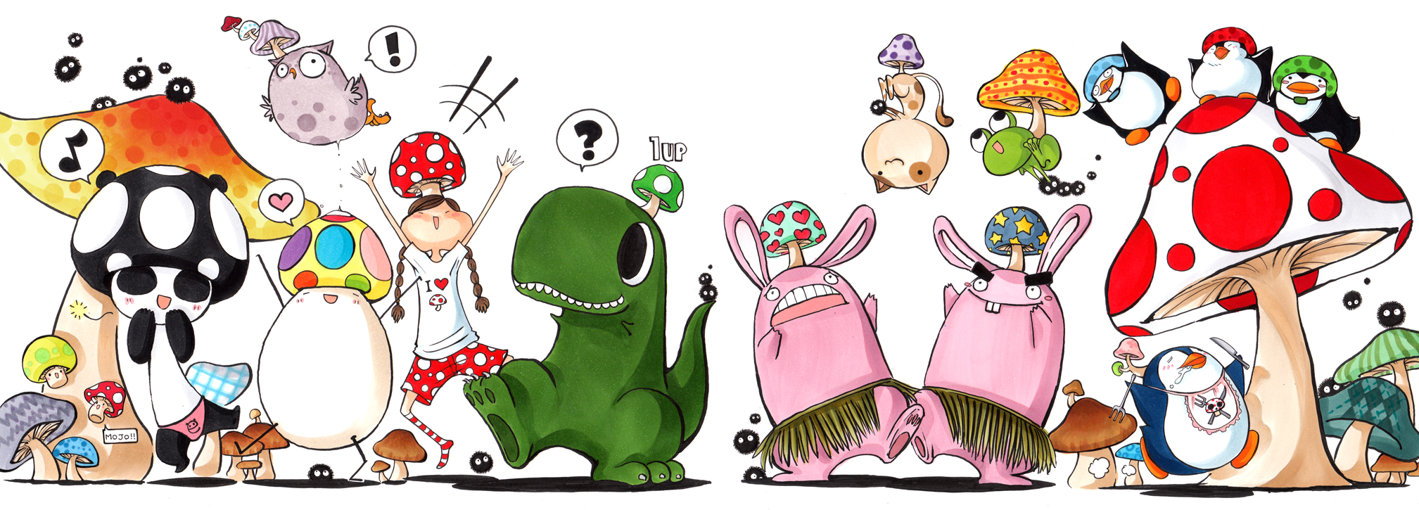
eeCAFE+ is our circle of friends. Each of us draw ourselves as an animal (except for me LOL) since it's easier and more easily recognizable. I get to be the only human because that cheeky girl looks more like me than any other animal... but at least I get the diseased owl as a pet 8D;; Everything here represents one of us, except for the three small black penguins. They're just there for cuteness's sake :'D
Cast of characters from left to right:
Panda: ~e1n
Egg: ~EggyComics
Girl+ Sickly owl: Me
Dinosaur: ~BullyKilla
Bunny x 2: ~barbaroo & ~nil00
Cat: ~ameru
Frog: ~rubberyjido
Retarded blue penguin: ~Banditzjing
Mushrooms is our theme because asdf;lkajsdf I LOVE SHROOOOMS (no, not that kind.) By the end of this, I was totally out of ideas for shroom patterns. I resorted to argyle and plaid shrooms /shot. And I couldn't help adding a handful of Ghibli sootballs
Image size
2017x725px 1.12 MB
© 2009 - 2024 cartoongirl7
Comments200
Join the community to add your comment. Already a deviant? Log In
The Good:
This piece has great rhythm created by the shape and colour. Unity through colour. I like how developed everything looks, each character having its own personality. There is a lot of balance in the work as well.
The Bad:
The focal point of the piece should be from the left of the dinosaur to the space between the two rabbits. That's where the eye is drawn to by default but in this piece it isn't quite so visually interesting. The movement is this piece is good but it all trail off the page and up instead of to another desired focal point. Those two points work against it. One last thing is there is so much negative space in the top middle, it feels lacking, for the rest of the picture the negative space is well filled up, but that gap is lacking.
Vision:
I don't think there is some great hidden or deep message to this picture, it is what it is, just a collection of friends and a good old time.
Originality:
I can't say i haven't seen anything like this before, but on the whole the composition of the image is well put together, it appears as though great thought went into it. Against the mess of other submissions to the cartoons category I think it might stand out.
Technique:
The marker technique is perfect, I have very little criticism, if any, on the technical aspect. I don't think I can say anything about it, other than its great.
Impact:
A great picture, I enjoyed looking over it immensely; finding all the little detail was fun and it is just a great fun picture. A great show in character design and use of copic markers.
Summary:
Great job, little bit of detractive negative space, overall good composition 9/10


