ShopDreamUp AI ArtDreamUp
Deviation Actions


Suggested Deviants


Suggested Collections


You Might Like…


Featured in Groups

Description
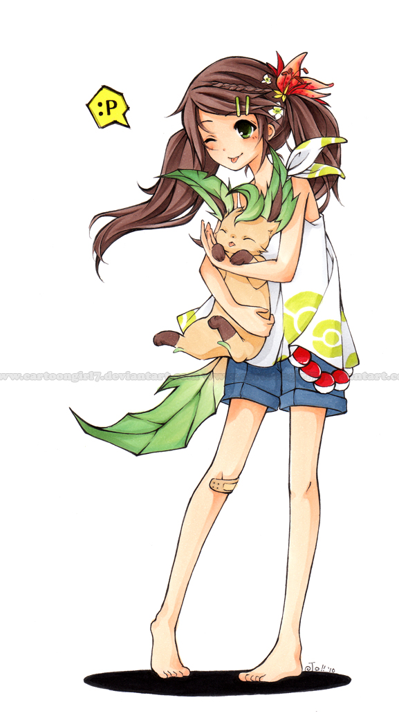
Tools: Copic Sketch marker, multiliners on manga manuscript paper.
Time: 6 hours.
A random doodle of an OC (from here: [link]) in my sketch book that I decided to light box onto a proper sheet of paper to color o3o
I love doing little drawings like these that don't require much commitment, unlike big pieces. I need to get cracking on my real work though ;; /rolls back into hiding
Pokemon (c) Nintendo
Character (c) Me
Image size
577x1042px 306.74 KB
© 2010 - 2024 cartoongirl7
Comments369
Join the community to add your comment. Already a deviant? Log In
Whoo! My second critique on your art. Wow, the only deviations I've critiqued so far are your deviations. That's pretty... I don't even know what the word for that is. <img src="e.deviantart.net/emoticons/l/l…" width="15" height="15" alt="
Okay, anyways. I'll go ahead and start now.
Vision
I know this is a doodle and I shouldn't be too critical, but when you ask for critique, I guess it means pointing out the faults, too. So here we go:
I really like this picture. It's just absolutely adorable! But when I started looking at it closer, bit by bit, some things started to bother me a bit.
Well, let's just start with the good: The color scheme is pleasant and... it's just wonderful. It's really cute and warm and fuzzy, just like it's supposed to be, and it's really sweet. I could go on and on about the good parts of the picture, but I think it's better if I point out the negatives more so you'll know where to improve. <img src="e.deviantart.net/emoticons/w/w…" width="15" height="15" alt="
First of all, the thighs. They're so thin! They're as thin as the lower part of the leg! Is that normal? This always bothers me, ALWAYS, because it just seems really abnormal to me. But stick-thin thighs like that always bother me, and that's just your style, so it isn't a 'wrong'. Aside from that, the pose in general seems really awkward to me. She's hunched over stiffly and is holding the Leafeon WAY too loosely. It seems almost as if the Leafeon's going to slip out of her arms easily. It kind of leaves me uneasy... even though it's just a picture, lol. So that seems really awkward. Also, is it just me, or are her arms way too short? If she stopped bending them and just laid them straight out by her side, I doubt they would go halfway down her thighs. They look like they'd end right at her waist, which is another thing which might add to why the pose looks a bit awkward. Also, I know it's a doodle, but instead of just white, I think you could've added, say, a shadow or something. It looks kind of blank just like this.
Hm, I guess I'd give it an overall 3.5 / 5. <img src="e.deviantart.net/emoticons/w/w…" width="15" height="15" alt="
Originality:
Her design is quite original. Her holding the Pokemon like that is something that's commonly seen, but that's okay. She matches with her Leafeon, which is nice. << (Lol I have no idea how to phrase that in a better way.) It's nice and sweet and didn't strike me as something I've seen so much. Basically, it's not repetitive and I think it's pretty original.
I'll give it a 4 / 5 for originality. <img src="e.deviantart.net/emoticons/l/l…" width="19" height="19" alt="
Technique:
Every time I critique you, I'm always going to give you a high number on your technique. Your technique is amazing. There's really nothing I can say. Other than the fact that in some places the coloring seems a bit flat, you've got real skill with using your copics. And you spent a nice amount of time on the picture, either, so i guess that just adds even more to your technique score. Like I said, the only thing you might need to work on is to add more depth in the shading in some places, but other than that, you're doing really, really good.
I'll give it a 4.5 / 5. <img src="e.deviantart.net/emoticons/l/l…" width="26" height="17" alt="
Impact:
I think the reason this didn't have that much of an impact on me is because of the white background. I was just like, oh, cute. And that's it. And then I got, for lack of better words, bored. So I guess not so much of an impact. Not to say that this isn't a beautiful deviation. It is. It's just that there's nothing more to this picture other than the fact that it's cute.
So I'll give it a 3 / 5. <img src="e.deviantart.net/emoticons/n/n…" width="15" height="15" alt="
That's about it!
Well, overall, nice job! I really enjoy critiquing your art.